library(igraph)
library(ggraph)
library(intronets)3 Visualizing Networks with ggraph
This chapter demonstrates network visualization procedures and strategies using the ggraph package. ggraph was designed to align with the coding principles used for the ggplot set of graphing functions in R.
As an illustration, we will use network data from the high tech managers study. Let’s begin by bringing igraph, ggraph, and intronets into our library.
3.1 Loading the high tech managers data
Now let’s load and examine the high tech managers data. These data were collected by David Krackhardt in the mid-1980s by surveying the managers of a small technology firm in California. (The CEO of the company is also included as one of the managers.) This dataset is especially good to illustrate network visualization because it is small and contains many vertex attributes.
load_nets("hi_tech.rda")The network data files contain three different relations among 21 managers in this high tech firm: friendships, advice relations, and direct reporting relationships. We’ll work with the friendships, which were collected by asking each manager, “Who is your friend?”
htfIGRAPH 19e59e2 DN-- 21 102 --
+ attr: name (v/c), age (v/n), tenure (v/n), level (v/n), dept (v/n)
+ edges from 19e59e2 (vertex names):
[1] X1 ->X2 X1 ->X4 X1 ->X8 X1 ->X12 X1 ->X16 X2 ->X1 X2 ->X18 X2 ->X21
[9] X3 ->X14 X3 ->X19 X4 ->X1 X4 ->X2 X4 ->X8 X4 ->X12 X4 ->X16 X4 ->X17
[17] X5 ->X2 X5 ->X9 X5 ->X11 X5 ->X14 X5 ->X17 X5 ->X19 X5 ->X21 X6 ->X2
[25] X6 ->X7 X6 ->X9 X6 ->X12 X6 ->X17 X6 ->X21 X8 ->X4 X10->X3 X10->X5
[33] X10->X8 X10->X9 X10->X12 X10->X16 X10->X20 X11->X1 X11->X2 X11->X3
[41] X11->X4 X11->X5 X11->X8 X11->X9 X11->X12 X11->X13 X11->X15 X11->X17
[49] X11->X18 X11->X19 X12->X1 X12->X4 X12->X17 X12->X21 X13->X5 X13->X11
[57] X14->X7 X14->X15 X15->X1 X15->X3 X15->X5 X15->X6 X15->X9 X15->X11
+ ... omitted several edgesThe “DN” tells us this is a directed network, which means that ego may nominate an alter as a friend, but that alter may not identify ego as a friend. Also note, in the list of edges, we can see arrows (“->”) between members of a tie rather than two lines (“–”), which is another indication that this network is directed rather than undirected. Technically speaking, ties that are directed are referred to as arcs as opposed to edges, but often network researchers use the term edges to generally refer to both undirected and directed ties.
The numbers after the “DN” tell us that there are 21 vertices and 102 edges. We have several vertex attributes, including age, tenure at the company, supervisory level, and department. These are all features that can be displayed as part of our visualizations. But we will start by developing a simple graph from this network that ignores these attributes.
3.2 Baseline visualization with ggraph
One of the main benefits of the ggraph package (as well as the ggplot package from which it was derived) is that it allows one to build complex graphs by adding multiple simple layers. The first portion of the command identifies the network object to graph. Then each subsequent line adds an element to the graph. In the code below, we will start by placing the nodes only.
ggraph(htf) +
  geom_node_point()
Using "stress" as default layout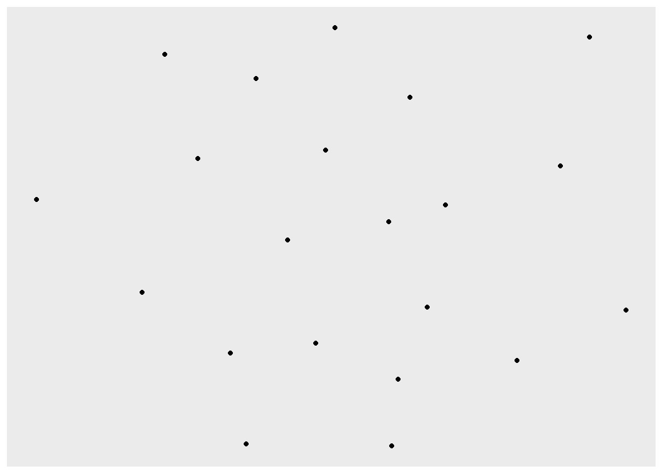
Only the nodes are placed in the graph. Now let’s add edges to show the friendships between the nodes by adding another layer to the command.
ggraph(htf) +
  geom_node_point() +
  geom_edge_link()
Using "stress" as default layout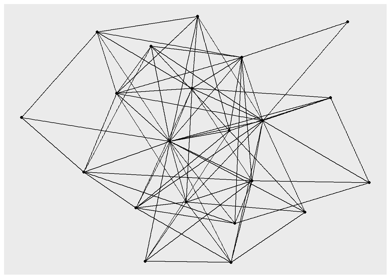
The default background is grey, which can make it difficult to see the nodes and edges, so let’s add another layer that changes the “theme” so that the background is white.
ggraph(htf) +
  geom_node_point() +
  geom_edge_link() +
  theme_void()
Using "stress" as default layout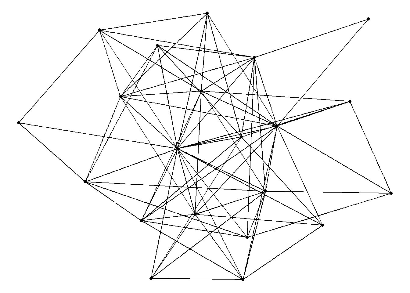
This is the basic code we will use for drawing networks. We can make various adjustments to these commands in order to visualize and highlight different aspects of the network.
3.3 Network layout basics
One of the most important features of these kinds of graphs is the layout. You may have noticed the warning that showed up when running the early code, indicating that “stress” is applied as the default layout. Stress is an algorithm that determines the placement of nodes on the basis of the ties between those nodes. More precisely, it is “force-directed” algorithm, because node placement is subject to a series of attractive and repulsive forces. Nodes repel one another, while lines between nodes operate as rubber bands that pull nodes closer together.
Force-directed algorithms are very effective for visualizing networks. The repulsive forces keep nodes from being overlayed on top of one another, which would make then hard to see. The attractive forces bring together nodes that are tied to one another. This allows the viewer to infer social closeness in a network on the basis of geometric proximity in the graph. In other words, two nodes tend to be closer to one another in a graph if they are connected to each other and also connected to similar others. Therefore, we can assume that those two nodes exist in similar social space. This is a very intuitive aspect of these kinds of algorithms.
To remove the warning from the output, we can add an explicit option in the first line of the code.
ggraph(htf, layout = "stress") +
  geom_node_point() +
  geom_edge_link() +
  theme_void()
The next chapter will offer other examples of network layouts, force-directed and otherwise. For now, we’ll proceed with stress as our default layout.
3.4 Common node and edge features
Without adding options to the geom_node_point and geom_edge_link layers, ggraph relies on the default display features. But we can make adjustments to many of those features. For example, the code below alters the size, color, and shape of the nodes, as well as the width, color, and transparency (alpha) of the edges.
ggraph(htf, layout = "stress") +
  geom_node_point(size = 8, color = "red", shape = "square") +
  geom_edge_link(width = 2, color = "grey", alpha = .3) +
  theme_void()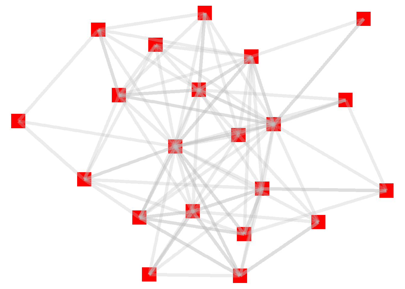
One thing to note here: the edges are overlayed on top of the nodes. That’s because we added the node layer first, followed by the edge layer. Let’s reverse that sequence in order to make the nodes more prominent (which is the standard approach for these kinds of graphs).
ggraph(htf, layout = "stress") +
  geom_edge_link(width = 2, color = "grey", alpha = .3) +
  geom_node_point(size = 8, color = "red", shape = "square") +
  theme_void()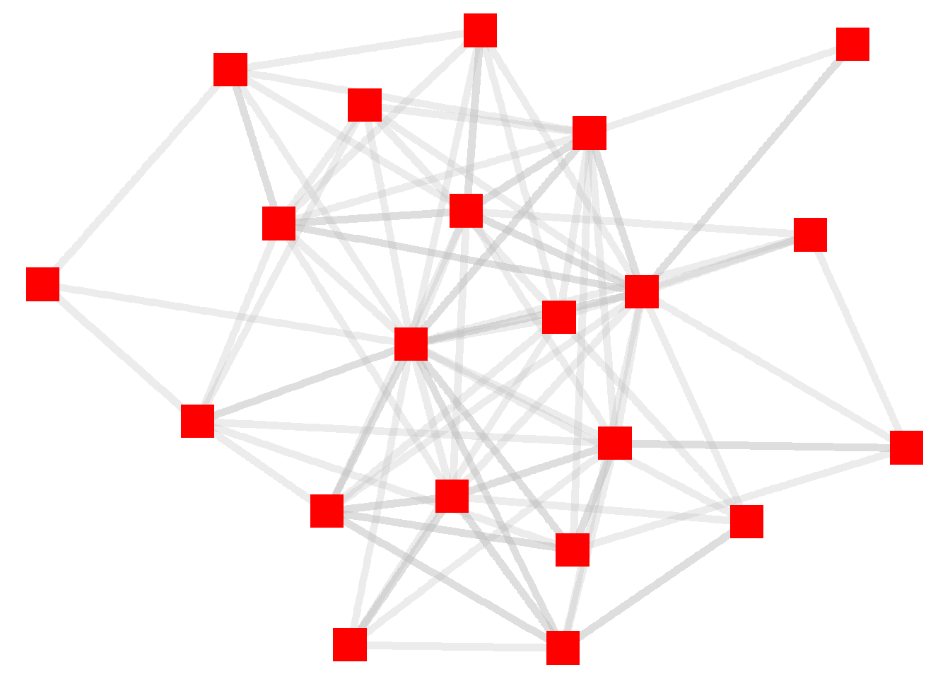
3.5 Visualizaing Node Attributes
You can think about these kinds of changes as “global” adjustments to the graph because we are applying a single standard (such as “square”) to all of the elements (such as nodes) in a graph. In some instances, we might want to apply individual features of the nodes or edges to the visualization.
To do this, we need to indicate that we want to use an attribute from the igraph object to be applied to the visualization. This is done by adding the “aes” (which is short for “aesthetic”) option to one of the layers. Let’s try this by altering the color of the nodes based on the department they are in. Remember that this information is located in the vertex attribute called “dept”.
ggraph(htf, layout = "stress") +
  geom_edge_link(width = 2, color = "grey", alpha = .3) +
  geom_node_point(aes(color = dept), size = 8, shape = "square") +
  theme_void()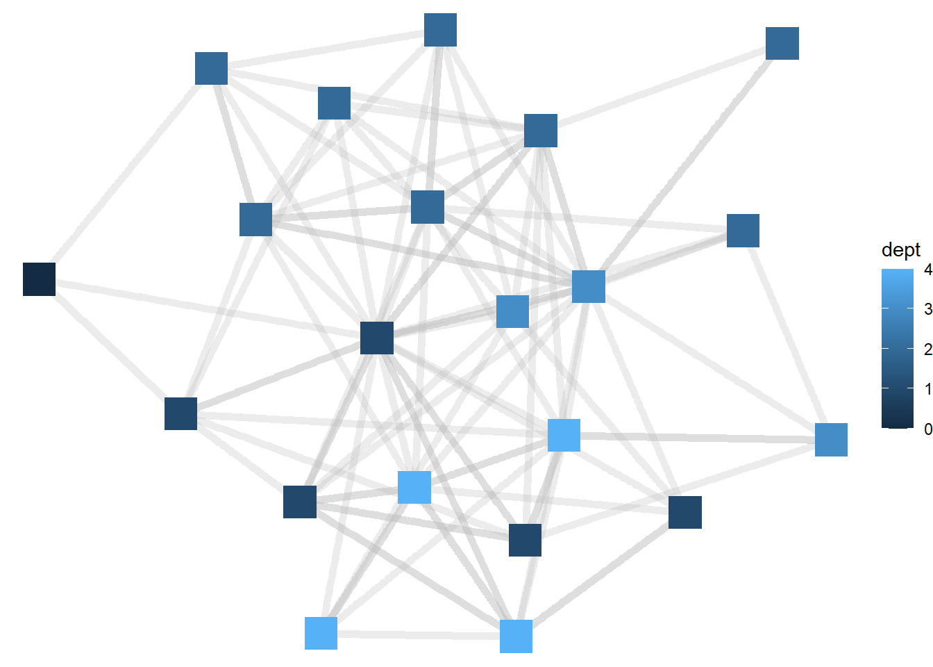
Now the node colors are colored from darker blue to lighter blue as the department for each manager gets larger. ggraph treats, by default, numeric variables such as department as continuous, but in this case it would be better to view departments as categorical (or distinct units). To do that, we will need to tell R to treat department as a factor variable.
ggraph(htf, layout = "stress") +
  geom_edge_link(width = 2, color = "grey", alpha = .3) +
  geom_node_point(aes(color = as.factor(dept)), size = 8, shape = "square") +
  theme_void()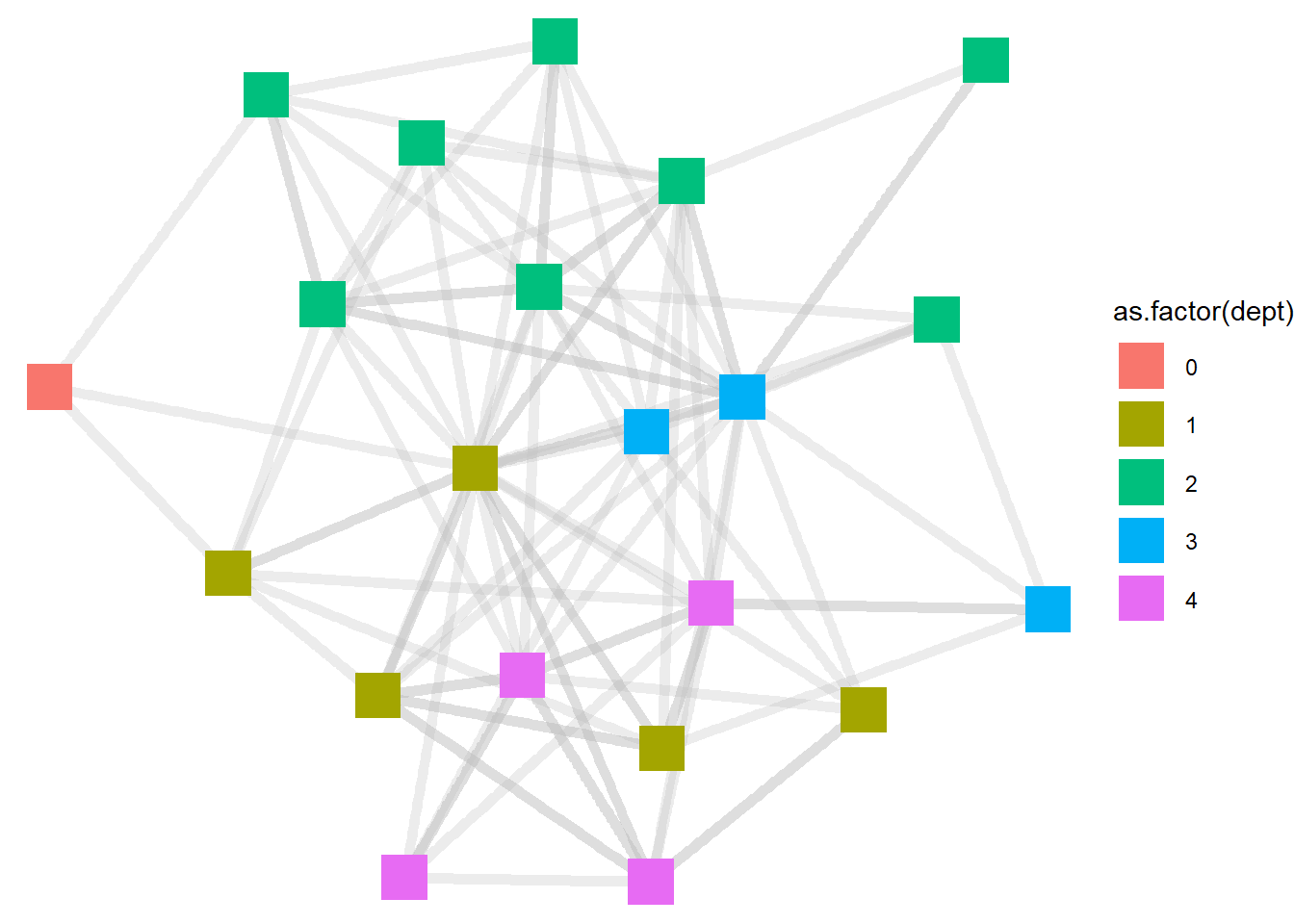
Now the visualizations show the department colors not as gradients, but as distinct. This seems helpful in this context, because this gives us a sense of the extent to which people in different departments share distinct friendship space (like the green nodes from department 2) or are more integrated with other departments (like the yellowish nodes from level 1).
Whenever we add an aesthetic feature from the igraph object, ggraph defaults to displaying a legend for that element. To remove that feature, which we do below, we can add a “show.legend = FALSE” option at the end of the layer. And when the layer line gets too long, we can drop each feature down a line, make the code easier to read.
ggraph(htf, layout = "stress") +
  geom_edge_link(width = 2,
                 color = "grey",
                 alpha = .3) +
  geom_node_point(aes(color = as.factor(dept)),
                  size = 8,
                  shape = "square",
                  show.legend = FALSE) +
  theme_void()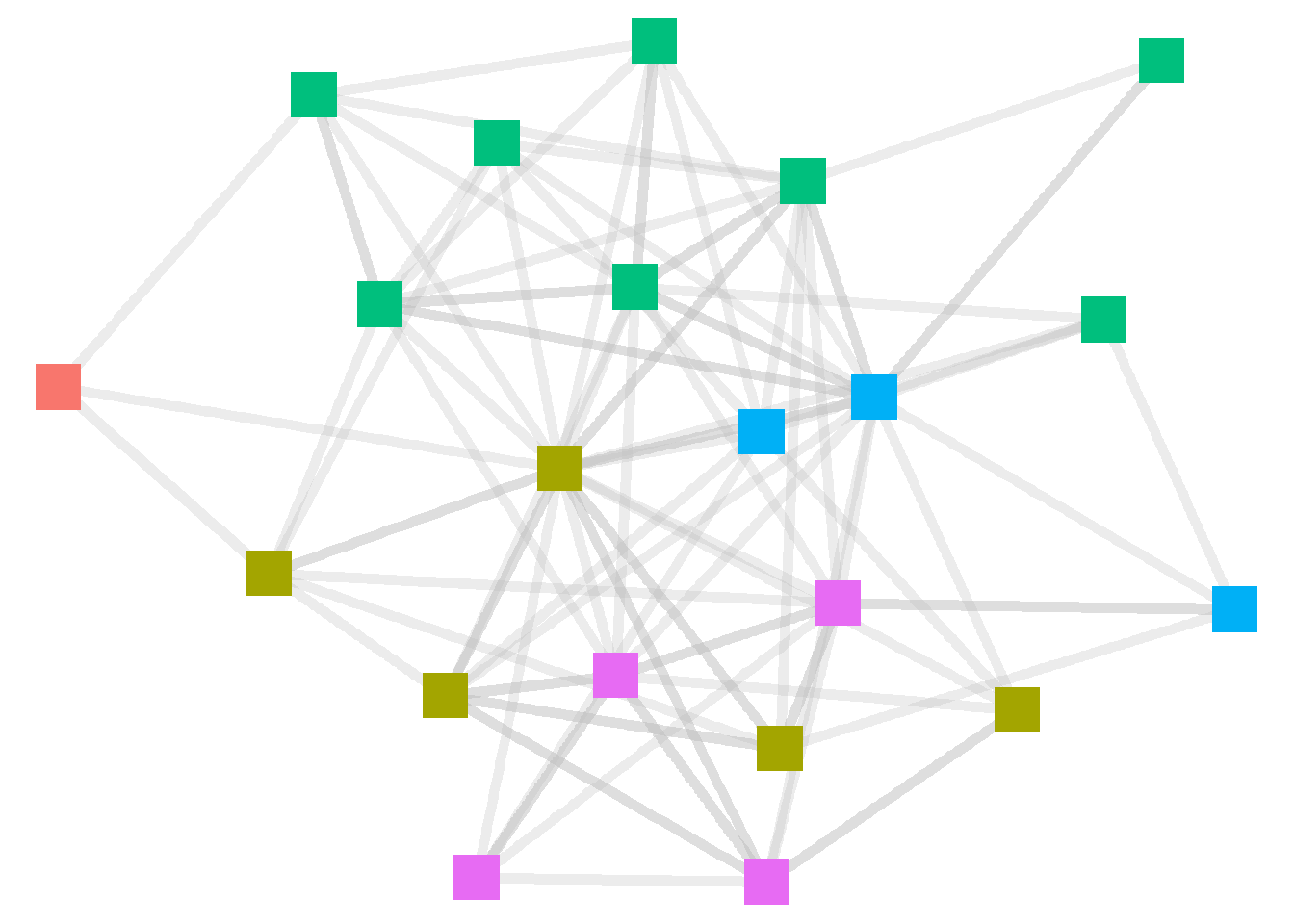
R automatically sets the color scheme. To manually set colors for the nodes, we can add a scale_color_manual layer to the code. See below.
ggraph(htf, layout = "stress") +
  geom_edge_link(width = 2,
                 color = "grey",
                 alpha = .3) +
  geom_node_point(aes(color = as.factor(dept)),
                  size = 8,
                  shape = "square",
                  show.legend = FALSE) +
  scale_color_manual(values = c("violet", "blue", "green","orange","red")) +
  theme_void()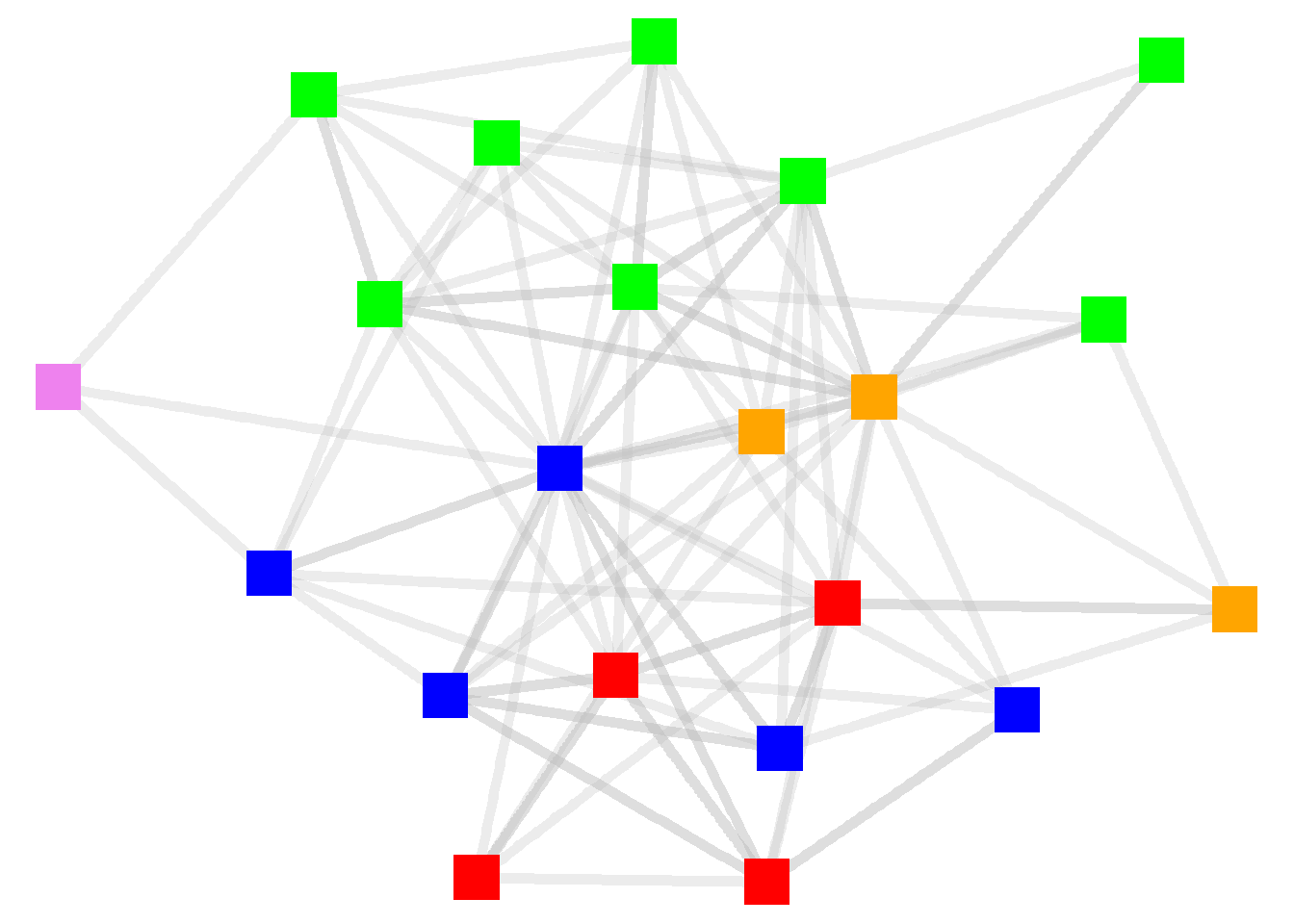
Let’s add other node attributes to the graph. Let’s base the shapes on the supervisory levels and the size based on their tenure. And now that we are displaying multiple attributes, let’s add the legend back in.
ggraph(htf, layout = "stress") +
  geom_edge_link(width = 2,
                 color = "grey",
                 alpha = .3) +
  geom_node_point(aes(color = as.factor(dept),
                      size = tenure,
                      shape = as.factor(level))) +
  theme_void()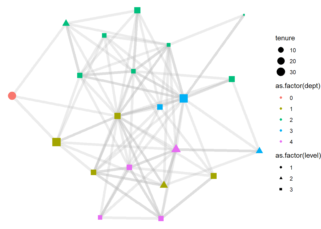
Now let’s clean up the labels in the legend. For this we need to add a separate “labs” layer. To that layer, we can also add a title for the figure.
ggraph(htf, layout = "stress") +
  geom_edge_link(width = 2,
                 color = "grey",
                 alpha = .3) +
  geom_node_point(aes(color = as.factor(dept),
                      size = tenure,
                      shape = as.factor(level))) +
  labs(title = "Friendships Among High Tech Managers",
       color = "Department",
       size = "Tenure",
       shape = "Level") +
  theme_void()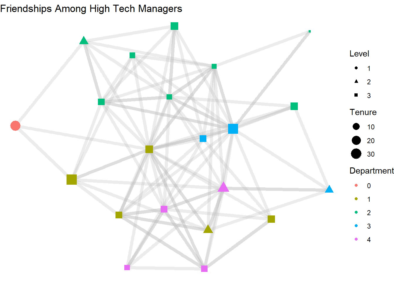
3.6 Node Labeling
Another common node feature to add is to label the node by its name. For this we also add another layer for “geom_node_text”. Add this after the geom_node_point layer to make sure it is not covered up by the point.
ggraph(htf, layout = "stress") +
  geom_edge_link(width = 2,
                 color = "grey",
                 alpha = .3) +
  geom_node_point(aes(color = as.factor(dept),
                      size = tenure,
                      shape = as.factor(level))) +
  geom_node_text(aes(label = name), size = 2) +
  labs(title = "Friendships Among High Tech Managers",
       color = "Department",
       size = "Tenure",
       shape = "Level") +
  theme_void()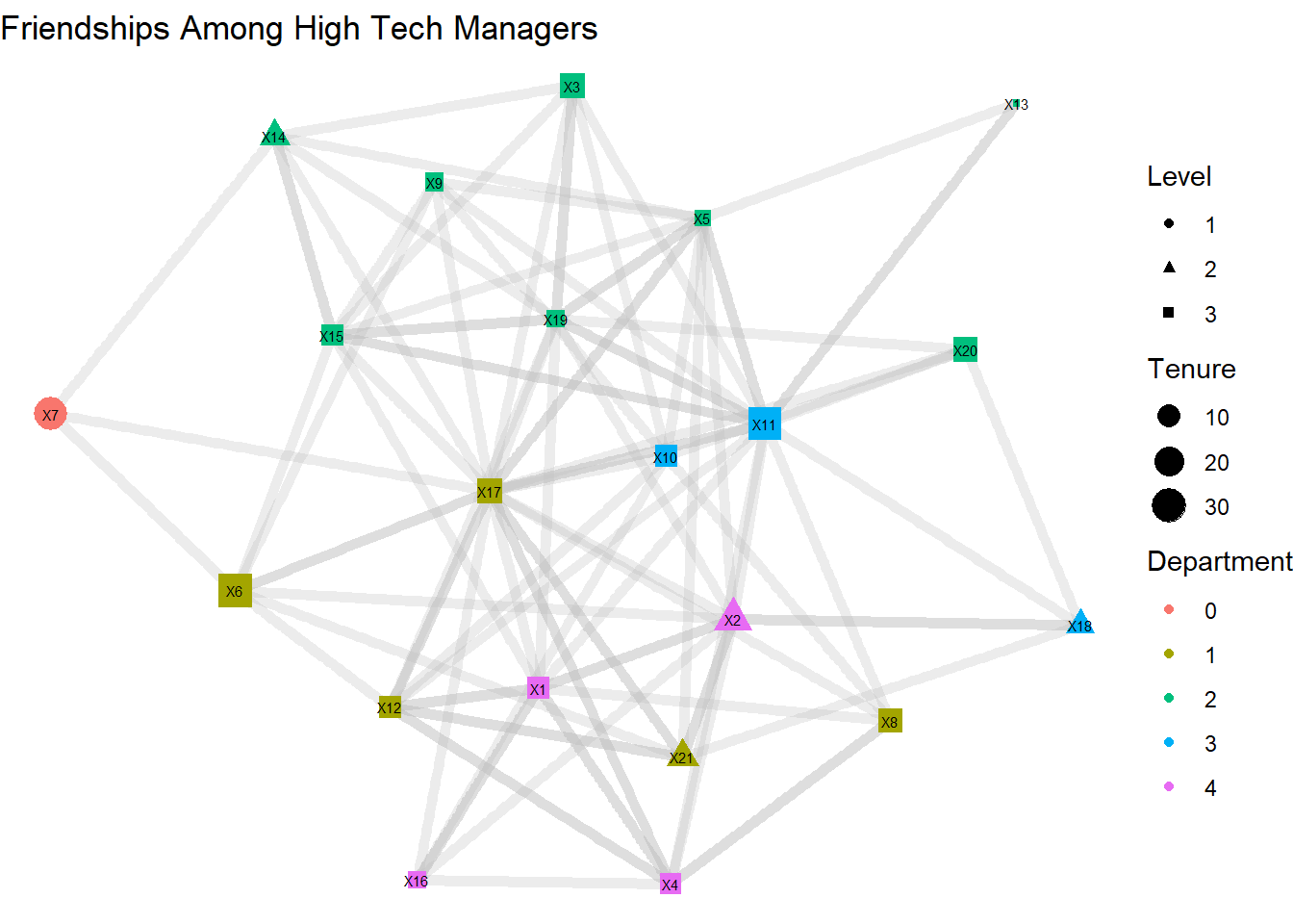
Alternatively, we can replace the geom_node_point and geom_node_text lines with a single line for geom_node_label, which we do below. This makes it much easier to see the labels, but it does eliminate our ability to manipulate the shape of the node.
ggraph(htf, layout = "stress") +
  geom_edge_link(width = 2,
                 color = "grey",
                 alpha = .3) +
  geom_node_label(aes(label = name,
                      color = as.factor(dept),
                      size = tenure)) +
  labs(title = "Friendships Among High Tech Managers",
       color = "Department",
       size = "Tenure") +
  theme_void()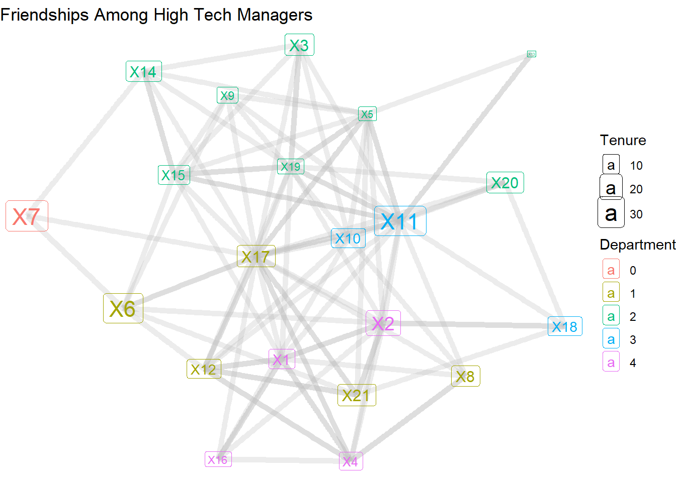
3.7 Arcs
As noted earlier, technically these ties are arcs, not edges. The direction of the ties can be shown by using the geom_edge_arc layer.
ggraph(htf, layout = "stress") +
  geom_edge_arc() +
  geom_node_label(aes(label = name,
                      color = as.factor(dept),
                      size = tenure)) +
  labs(title = "Friendships Among High Tech Managers",
       color = "Department",
       size = "Tenure") +
  theme_void()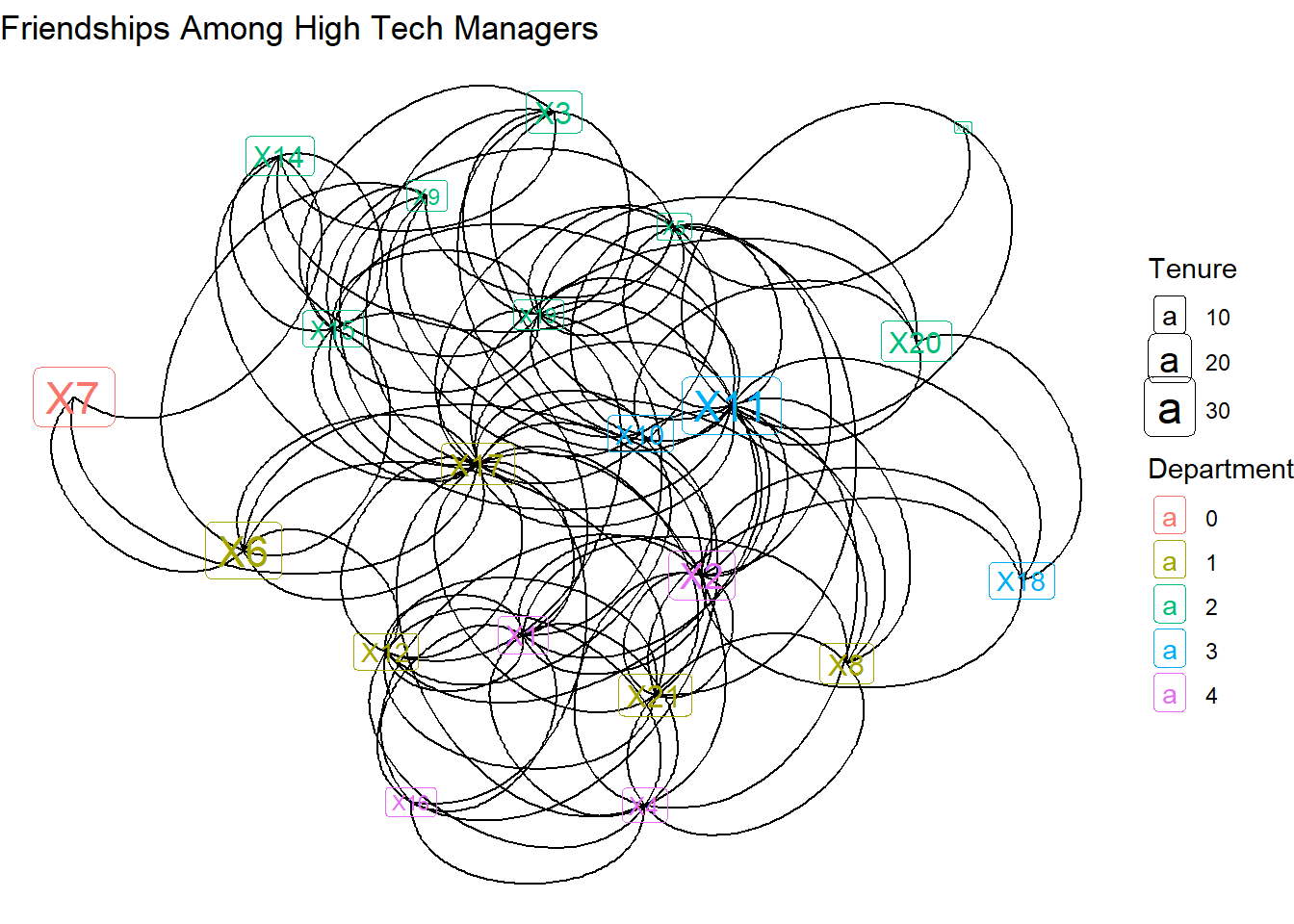
Instead of straight lines, we get curved lines. This is needed because each dyad has the potential for two connecting lines. But which direction are the lines headed in? For that we need to add arrows. The “length” indicates how big the arrows are and “closed” fills in the arrow heads.
ggraph(htf, layout = "stress") +
  geom_edge_arc(arrow = arrow(length = unit(3, 'mm'), type = 'closed')) +
  geom_node_label(aes(label = name,
                      color = as.factor(dept),
                      size = tenure)) +
  labs(title = "Friendships Among High Tech Managers",
       color = "Department",
       size = "Tenure") +
  theme_void()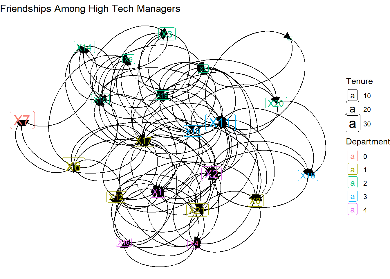
Only a few of the arrows are visible. That’s because the arrows end, by default, at the center of the label. Below we can add code that starts and ends the caps based on the label.
ggraph(htf, layout = "stress") +
  geom_edge_arc(aes(start_cap = label_rect(node1.name,
                                           padding = margin(2, 2, 2, 2, 'mm')),
                    end_cap = label_rect(node2.name,
                                         padding = margin(2, 2, 2, 2, 'mm'))),
                arrow = arrow(length = unit(3, 'mm'), type = 'closed')) +
  geom_node_label(aes(label = name,
                      color = as.factor(dept),
                      size = tenure)) +
  labs(title = "Friendships Among High Tech Managers",
       color = "Department",
       size = "Tenure") +
  theme_void()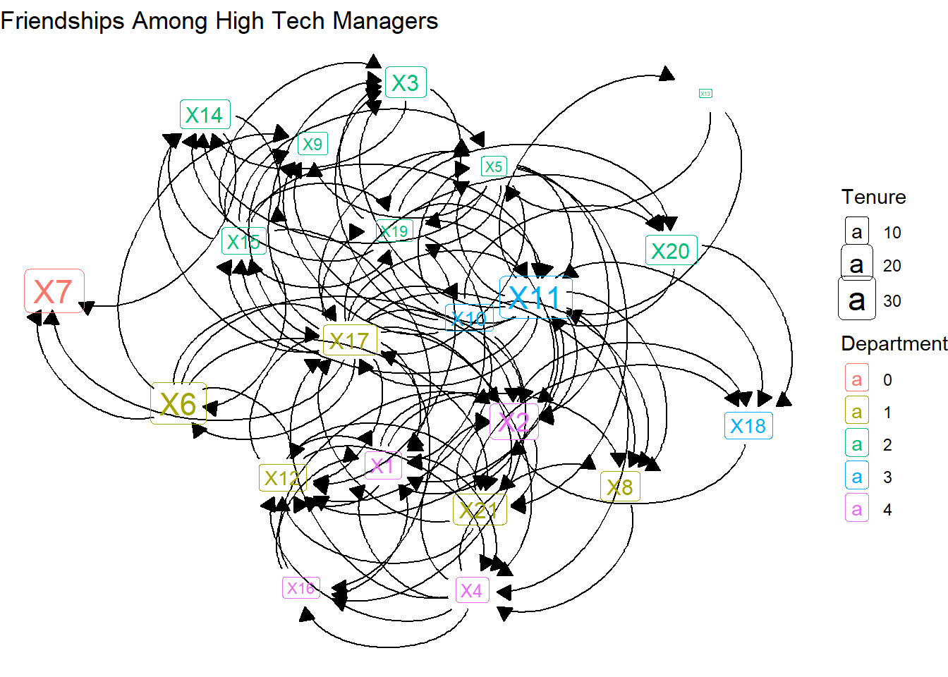
Further, we can adjust the curvature (the “strength” option) and color of those arcs.
ggraph(htf, layout = "stress") +
  geom_edge_arc(aes(start_cap = label_rect(node1.name,
                                           padding = margin(2, 2, 2, 2, 'mm')),
                    end_cap = label_rect(node2.name,
                                         padding = margin(2, 2, 2, 2, 'mm'))),
                arrow = arrow(length = unit(3, 'mm'), type = 'closed'),
                strength = .2,
                color = "grey") +
  geom_node_label(aes(label = name,
                      color = as.factor(dept),
                      size = tenure)) +
  labs(title = "Friendships Among High Tech Managers",
       color = "Department",
       size = "Tenure") +
  theme_void()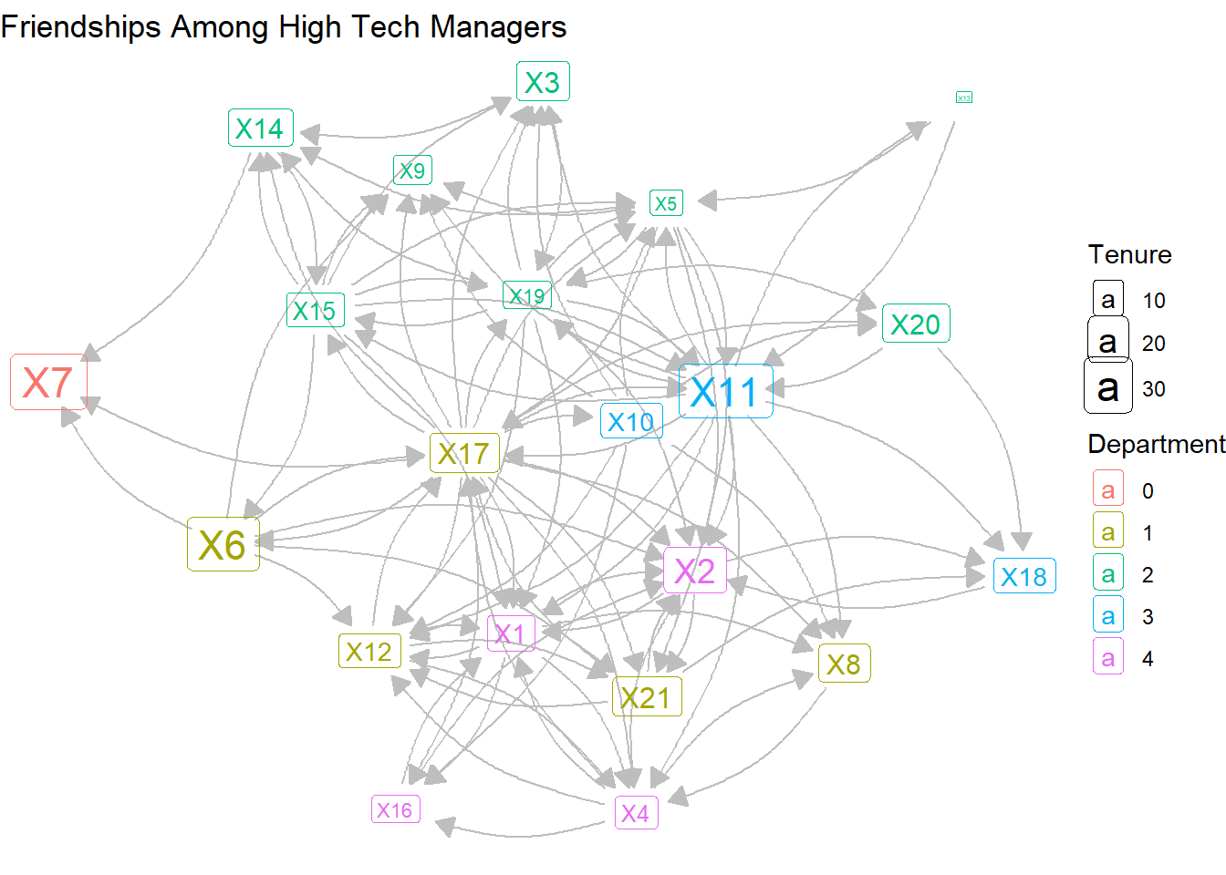
Reducing the curvature and lightening the arc colors makes the graph a bit more palatable. But the density of the network is quite high, so the visualization is a bit messy. So we might want to find another way to visualize the mutual versus non-reciprocated ties.
3.8 Edge weights
This is a binary (1,0) network that only shows the presence or absence of a directed tie. But we could generate edge weights to indicate whether a tie is uni-directional or bi-directional. Below is the simplest way to do this. First, we create a constant weight value of 1 for all edges in the htf network. Second, we transform the directed network into an undirected version, but sum the values for each edge by its number of arcs in the directed network. To see if this worked, we produce a table showing the weight values in the new network.
E(htf)$weight <- 1
htf_undirected <- as_undirected(htf, mode = "collapse",
                              edge.attr.comb = list(weight = "sum"))
table(E(htf_undirected)$weight)
 1  2
56 23
These results show that there are 56 non-reciprocated edges, compared with 23 reciprocated edges. Armed with this new edge attribute, we can return to the geom_edge_link layer and adjust the width based on this distinction.
ggraph(htf_undirected, layout = "stress") +
  geom_edge_link(aes(width = weight),
                 color = "grey",
                 alpha = .3,
                 show.legend = FALSE) +
  geom_node_label(aes(label = name,
                      color = as.factor(dept),
                      size = tenure)) +
  labs(title = "Friendships Among High Tech Managers",
       color = "Department",
       size = "Tenure") +
  theme_void()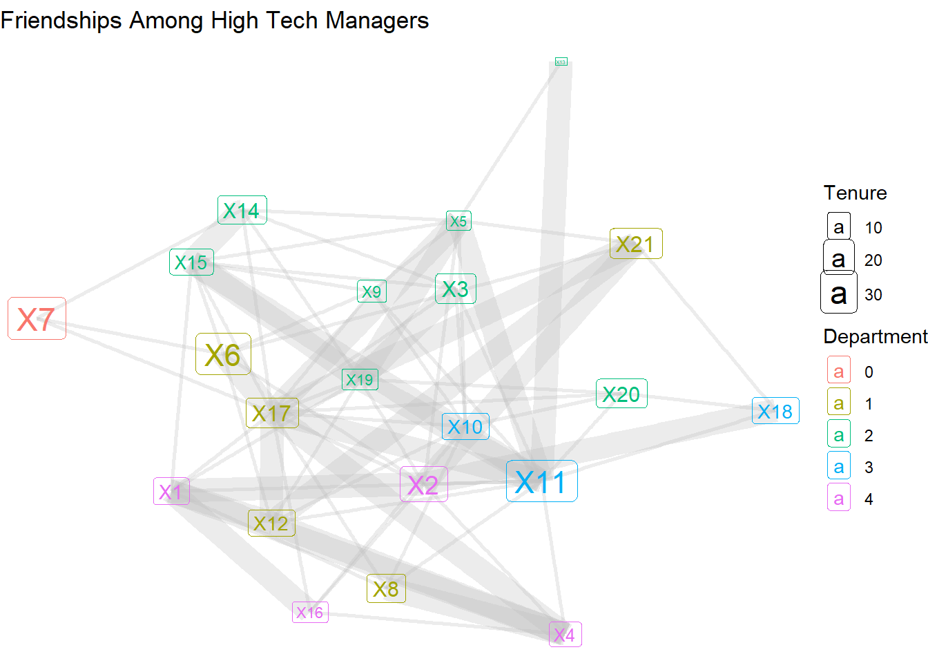
…or with color and dashed lines.
ggraph(htf_undirected, layout = "stress") +
  geom_edge_link(aes(linetype = as.factor(weight),
                     color = as.factor(weight)),
                 width = 1.5,
                 alpha = .3,
                 show.legend = F) +
  geom_node_label(aes(label = name,
                      color = as.factor(dept),
                      size = tenure)) +
  scale_edge_linetype_manual(name = "Connection Type",
                             values = c("1" = "dashed",
                                        "2" = "solid"),
                             labels = c("1" = "Unidirectional",
                                        "2" = "Bidirectional")) +
  labs(title = "Friendships Among High Tech Managers",
       color = "Department",
       size = "Tenure") +
  theme_void()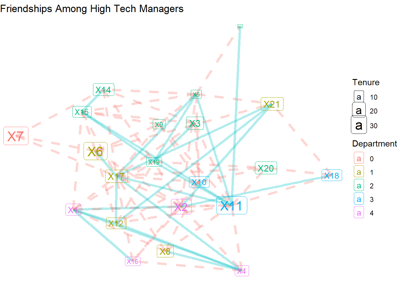
There are many more options for customizing your network visualizations, but here we’ve covered the basics, emphasizing how to layer edge, node, and label features, as well as adding various options for incorporating node and edge attributes into the visualizations. In the next chapter, we will explore various network layouts and other more advanced customizations.
3.9 References
For more information on the high tech managers network…
- Krackhardt D. (1987). Cognitive social structures. Social Networks, 9, 104-134.